You can create a logo with Nano Banana in the browser. Open the on-site generator, type a short brief, and you will get logo concepts and wordmarks you can treat as working drafts. This article shows the steps on nanobanana-2.com and gives you 10 copy-ready prompts in four styles: minimalist, modern tech, luxury, and 3D. Each prompt is written so you can paste it in and generate a first round without rewriting it. If you already have a name and a look in mind, skip ahead to the prompt section and start from the style that fits. If you are starting from scratch, use the step-by-step section first.
Can You Create a Logo with Nano Banana?
Yes. In the browser you can generate logo concepts and wordmarks, including marks that carry the brand name as type. That is the useful part of early design work: you can test a name, a color pair, and a style in a few minutes and leave with drafts worth keeping.
What you download is a raster image — PNG or JPG from Image Preview — not a finished SVG. If you later need a vector file for print or a favicon set, treat the generated mark as the reference and trace it in a vector tool. That tracing step sits outside this guide; the job here is to get a mark clean enough to trace.
Type is usually the other limit. Short names set in quotes tend to land more reliably than long taglines. Even then, read every letter before you commit to a direction. I still check the spelling on every pass, and I shrink the file to favicon size to see whether the mark holds. A logo that looks polished at full width can collapse into a blob when it sits in a tab or a nav bar.
Credit use is visible before you generate: the screen shows Cost and Remaining credits. Plan prices live on the Nano Banana pricing page; this section will not reprint a full table.
The first example is a simple coffee wordmark on white.

How to Create a Logo with Nano Banana
-
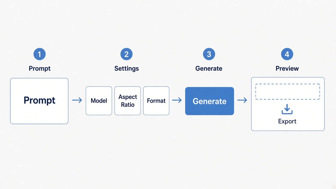
Open the on-site Nano Banana logo generator and sign in. The control is labeled Sign in to generate.
-
Stay on Text to Image and write a short, specific prompt: put the brand name in quotes, name the style, lock two or three colors, ask for a pure white background, and rule out extra scenery. The Prompt box is the brief. The placeholder asks you to describe the image, including its subject, setting, light and style, and the field accepts a long prompt, up to 20,000 characters. For logos, short and specific beats long and poetic. Switch to Image to Image later if you want to upload a reference sketch or an earlier result and push it in a new direction.
-
Before you generate, check Model, Aspect Ratio, and Format. A square ratio is usually enough; PNG is the better default for a clean edge on white. The screen also shows Cost for that run — the page has displayed Cost 5 credits as an example — and Remaining credits. Use the number on screen for your session rather than a figure remembered from somewhere else.
-
Generate more than one version, then revise one attribute at a time. When something is close, write a follow-up that changes one thing only: the color, the letter spacing, or the mark above the type. If you change three things at once, you will not know which edit helped.
-
Download the keeper from Image Preview as PNG or JPG.
You can ask the model for a flat vector style, but the download is still a PNG or JPG. Flat vector style is not the same as an SVG with editable paths. If you need a vector file, trace the approved mark in a vector tool.
10 Nano Banana Logo Prompts You Can Try
The ten prompts below are the ones used for the marks in this article. Each one is a complete brief you can paste into the Prompt box. I kept the names short, put them in quotes, and asked for a white field with no extra scene. Swap the name and the colors for your own brand, but keep that structure.
Minimalist Logo Design
Minimal marks work when the type is short and the symbol is one idea, not five. These three are built that way: a coffee wordmark, a studio monogram, and an apparel label.
A clean starting point for a coffee brand is a two-color wordmark with a simple light symbol, nothing else in the frame:
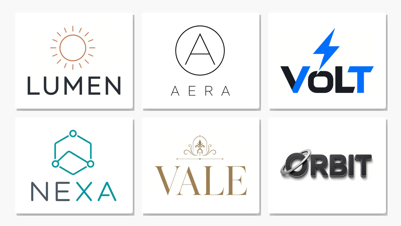
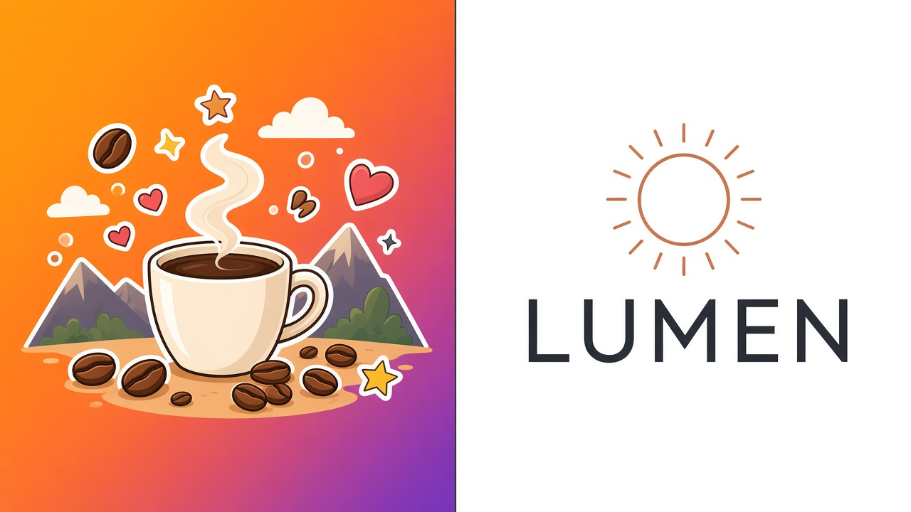
A minimalist logo for a coffee brand named "LUMEN", flat vector wordmark, the word LUMEN in a clean geometric sans-serif, a simple circular sun or light mark above the type, two colors only: warm terracotta and deep charcoal, centered on a pure white background, no scene, no texture, no gradient, no shadow.

For a studio, drop the color almost entirely and let a thin monogram carry the identity:
A minimalist logo for a design studio named "AERA", flat vector mark, a thin circular monogram built from the letter A, the word AERA in light letter-spacing underneath, black ink on a pure white background, no extra shapes, no scene, no gradient, no shadow.

Apparel can stay just as reduced — a condensed name and one geometric accent:
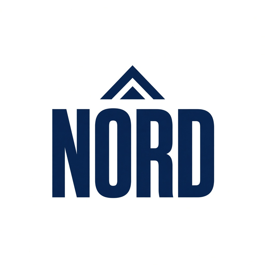
A minimalist logo for an apparel brand named "NORD", flat vector wordmark, the word NORD in a tight condensed sans-serif, a small northern chevron or peak as a simple geometric accent, navy and off-white only, centered on a pure white background, no clothing, no scene, no gradient, no shadow.
Modern Tech Logo
Tech marks read clearly when the geometry is sharp and the palette stays tight. The three prompts below use a lightning slash, a hexagon node, and a simple industrial monogram.
A modern tech logo for a software product named "VOLT", flat vector mark, a sharp lightning slash integrated with the word VOLT in a bold geometric sans-serif, electric blue and near-black, centered on a pure white background, no circuit board, no city, no gradient, no glow, no shadow.

A modern tech logo for a cloud service named "NEXA", flat vector wordmark, the word NEXA in a precise monoline sans-serif, a simple hexagon node as the mark, teal and slate gray, centered on a pure white background, no servers, no clouds in the sky, no gradient, no shadow.

A modern tech logo for a developer tools company named "FORGE", flat vector mark, a simple anvil or bracket monogram next to the word FORGE in a sturdy sans-serif, charcoal and rust orange, centered on a pure white background, no workshop scene, no gradient, no shadow.

Luxury Brand Logo
Luxury prompts should sound like typography, not like a product shot. Name the serif, cap the palette, and keep bottles, flowers, and marble out of the frame.
A luxury logo for a high-end perfume house named "VALE", elegant serif wordmark, the word VALE in high-contrast didone lettering, a thin gold line or small crest above the type, ivory and muted gold only, centered on a pure white background, no bottle, no flowers, no scene, no gradient, no soft shadow.

A luxury logo for a jewelry house named "AURUM", refined serif wordmark, the word AURUM in classic roman capitals with slightly tighter tracking, a simple diamond or faceted gem outline as a small mark, deep burgundy and antique gold, centered on a pure white background, no jewelry product shot, no marble, no gradient, no shadow.

3D Logo Design
A 3D logo still has to work as a mark, not as a product render. Ask for the name in dimensional type, sit it on white, and leave the actual product out of the scene.
A 3D logo for a headphone brand named "ORBIT", a soft-rendered three-dimensional wordmark of the word ORBIT, rounded letters with a subtle beveled edge and a small orbital ring around the O, matte charcoal and satin silver, sitting on a pure white background, studio product-logo lighting, no headphones in the scene, no environment, no busy reflection, no gradient backdrop.

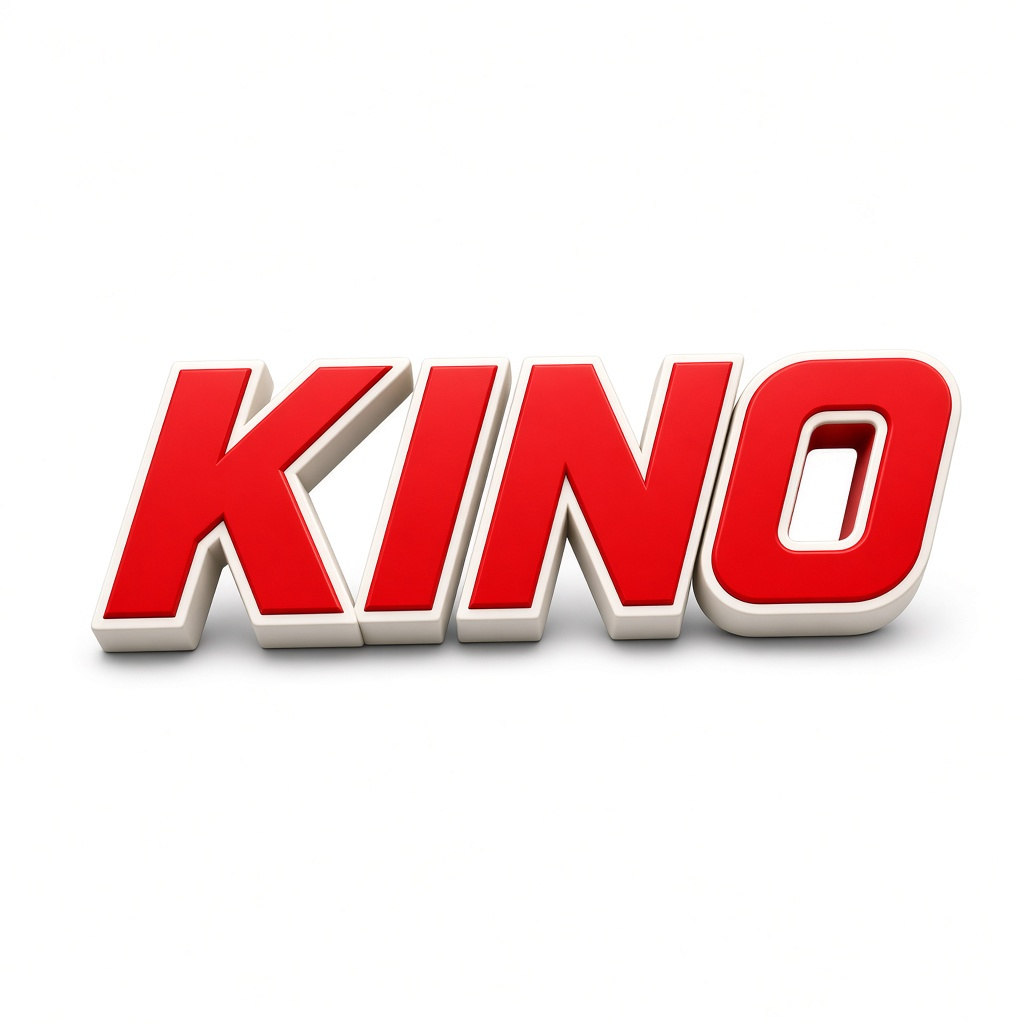
A 3D logo for a sports brand named "KINO", a bold three-dimensional wordmark of the word KINO, compact italic block letters with a soft plastic or enamel finish, vivid red and off-white, centered on a pure white background, clean studio lighting, no athletes, no stadium, no gradient backdrop, no extra props.
How to Improve Your Nano Banana Logo Designs
Once you have a mark you almost like, stop generating new concepts and start tightening the one you have.
On type, read every letter. If a character is wrong or a stroke is uneven, ask only for a spelling or weight correction. Keep the name short; a five-to-seven letter wordmark is easier to hold than a sentence. If the letters feel cramped, ask for more tracking and nothing else.
On color, cap the palette at two or three colors. A third accent is fine; a fifth usually means the mark will not survive a single-color print. I also run a monochrome test: the same logo in black on white, then white on black. If the shape disappears, simplify it.
On composition, add space around the mark. A logo that fills the whole frame is harder to drop into a nav bar or a business card. I generate a version with more margin, then shrink both the color and the monochrome files down to about 64 pixels and 16 pixels. If I can still read the name or recognize the symbol, the structure is strong enough to keep.
The first AERA pass below is the crowded version: a heavy wreath, three mixed colors, and a monogram that tries to do too much. The revised pass keeps only black on white, opens the tracking, and leaves a clear margin. That is the kind of single-issue revision that actually improves a draft.


Before Using Your AI-Generated Logo
- Check the spelling.
- Test the logo at small sizes.
- Check whether the symbol works in monochrome.
- Verify that the design is sufficiently distinctive.
- Review potential trademark conflicts before commercial adoption.
Common Nano Banana Logo Design Mistakes
A vague prompt — "a nice logo for a coffee shop" — tends to produce clip art: a cup, a bean, maybe a skyline, all competing. Write the name, the style, the colors, and the white field, and say what should not appear.
Backgrounds, gradients, and drop shadows make a mark harder to use. A logo that only works on a sunset wash will fight every layout you put it in. Ask for a pure white background and no shadow, then place the mark on other grounds yourself later.
Long taglines and unquoted names are the usual type failures. "Lumen Specialty Coffee Roasters since 2019" is too much text for one mark. Put the short name in quotes and leave the slogan out of the logo pass.
Do not treat the downloaded PNG or JPG as a finished vector file. It is a raster draft. If you need SVG or print-ready paths, trace the approved mark in a vector tool after you have chosen a direction.
Frequently Asked Questions
Can Nano Banana generate logos with text?
Yes. Short names set in quotes tend to land more reliably than long taglines. Even then, read every letter before you commit to a direction.
Can I create a transparent logo with Nano Banana?
The download is a PNG or JPG, usually generated on a pure white background. If you need a transparent mark, start on white and remove the background in an editor.
Can I download a Nano Banana logo as SVG?
No. What you download from Image Preview is a raster PNG or JPG, not an SVG with editable paths. You can prompt for a flat vector style — that is a look, not a vector file. If you need SVG, trace the approved mark in a vector tool.
How do I fix incorrect text in a Nano Banana logo?
Put the short name in quotes and generate again. If a version is close, ask only for a spelling or weight correction, and check every letter on the new pass.
If you have a name ready, open the on-site generator, paste one of the prompts above, and start with a small set of drafts.