
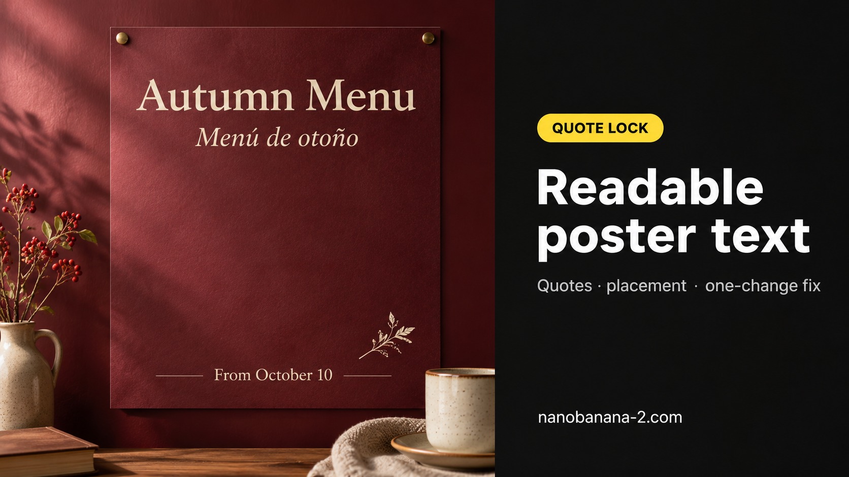
Quick answer: Nano Banana text rendering stays readable when you put every on-image line in
"quotes", name the type style and placement, keep the copy short, then generate once. If one letter melts, fix only that string—do not rewrite the whole poster. Run the loop in the AI image generator.
You came here to ship a poster (or menu / event card) where the words survive a 100% zoom—not another essay about “AI typography.” This guide is a typesetting workflow: quote the exact words → run a poster checklist → fix misspellings one change at a time. We learn the “quote the string” habit from public Nano Banana prompting notes (e.g. Google Cloud’s Ultimate prompting guide for Nano Banana) and deliberately skip their API / Vertex CTAs—this page stays on a poster-ready still you can zoom.
Quote the Exact Words Before You Generate
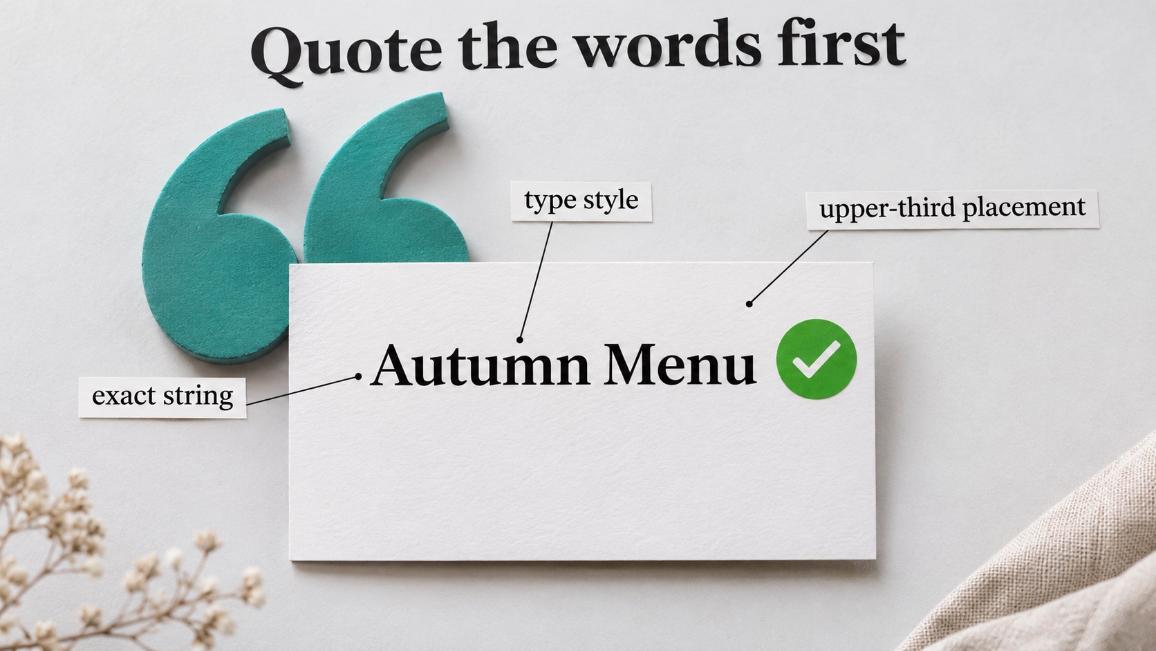
Melting letters almost always start with paraphrased copy. The model invents a “close enough” line; you get soup. Lock the string first.
Copy block — quote lock
Design a [FORMAT: café wall poster]
on a [BG: deep burgundy] field.
Type style: [cream serif, high contrast].
Exact title at the top: "Autumn Menu".
Exact secondary line: "Menú de otoño".
Exact footer: "From October 10".
Place title in the upper third.
Secondary centered under it.
Footer near the bottom margin.
Generous margins.
One small motif lower-right only.
Aspect ratio [3:4].
Language of type: as written in the quotes.
How to use it
- Open Nano Banana’s image generator and paste the block.
- Replace brackets. Do not rewrite the quoted lines—copy-paste the final marketing string.
- Name placement in plain words (
upper third,centered under title). Vague “nice typography” does nothing for Nano Banana text rendering. - Read the live credit estimate in the UI, then generate once.
Why quotes beat keyword piles
| Habit | What happens | What to do instead |
|---|---|---|
| No quotes, “autumn menu vibe” | Model invents spelling variants | Put "Autumn Menu" in quotes |
| Three long sentences of type | Small glyphs melt at final size | Cap at 1 title + 1 sub + 1 footer |
| Style adjectives only | Pretty blur, wrong letters | Style plus exact string + placement |
| Regenerate whole art for one typo | Layout drifts every pass | Keep art; edit the string only (next section) |
Poster Checklist Before You Hit Generate
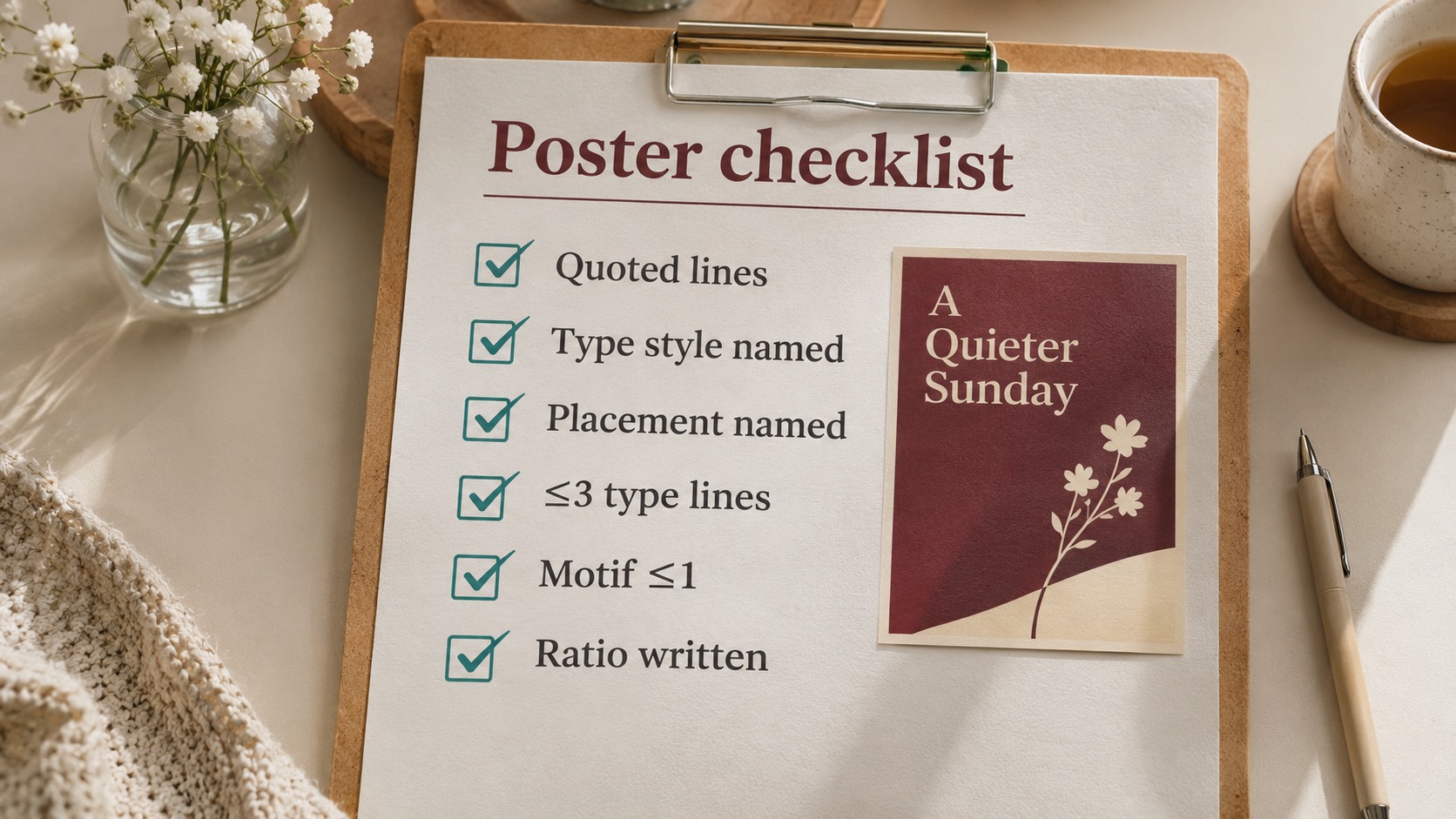
Run this list once. It costs nothing and saves a wasted pass.
Poster checklist
- Every on-image line is inside
"quotes"and matches marketing copy character-for-character - Type style named (serif / sans / condensed) + contrast note (light on dark / dark on light)
- Placement named (top / upper-third / centered / footer)
- At most three type lines for a first pass
- Motif count ≤ 1 (or zero)—type is the hero
- Aspect ratio written (
3:4,1:1,16:9) - You will zoom to 100% after generate before calling it done
Mini variants (same checklist)
Fill every quoted slot with real marketing strings—do not leave empty "" placeholders.
| Job | Ratio | Quoted example (fill these) | Add-on |
|---|---|---|---|
| Café wall / print feel | 3:4 |
Title "Autumn Menu" Secondary "Menú de otoño" Footer "From October 10" |
Generous margins; avoid edge-hugging type |
| Feed square | 1:1 |
Title "OPEN" Secondary "Tonight 7pm" Footer "Walk-ins OK" |
Shorten secondary; prefer two lines max. Drop footer only if the crop is already crowded. |
| Wide hero / banner | 16:9 |
Title "Summer Sale" Secondary "Up to 40% off" Footer "Ends Sunday" |
Leave a quiet third for later layout type |
If the first still fails at zoom, do not dump more adjectives into the brief. Go to the one-change fix below.
Fix Misspellings With One Change
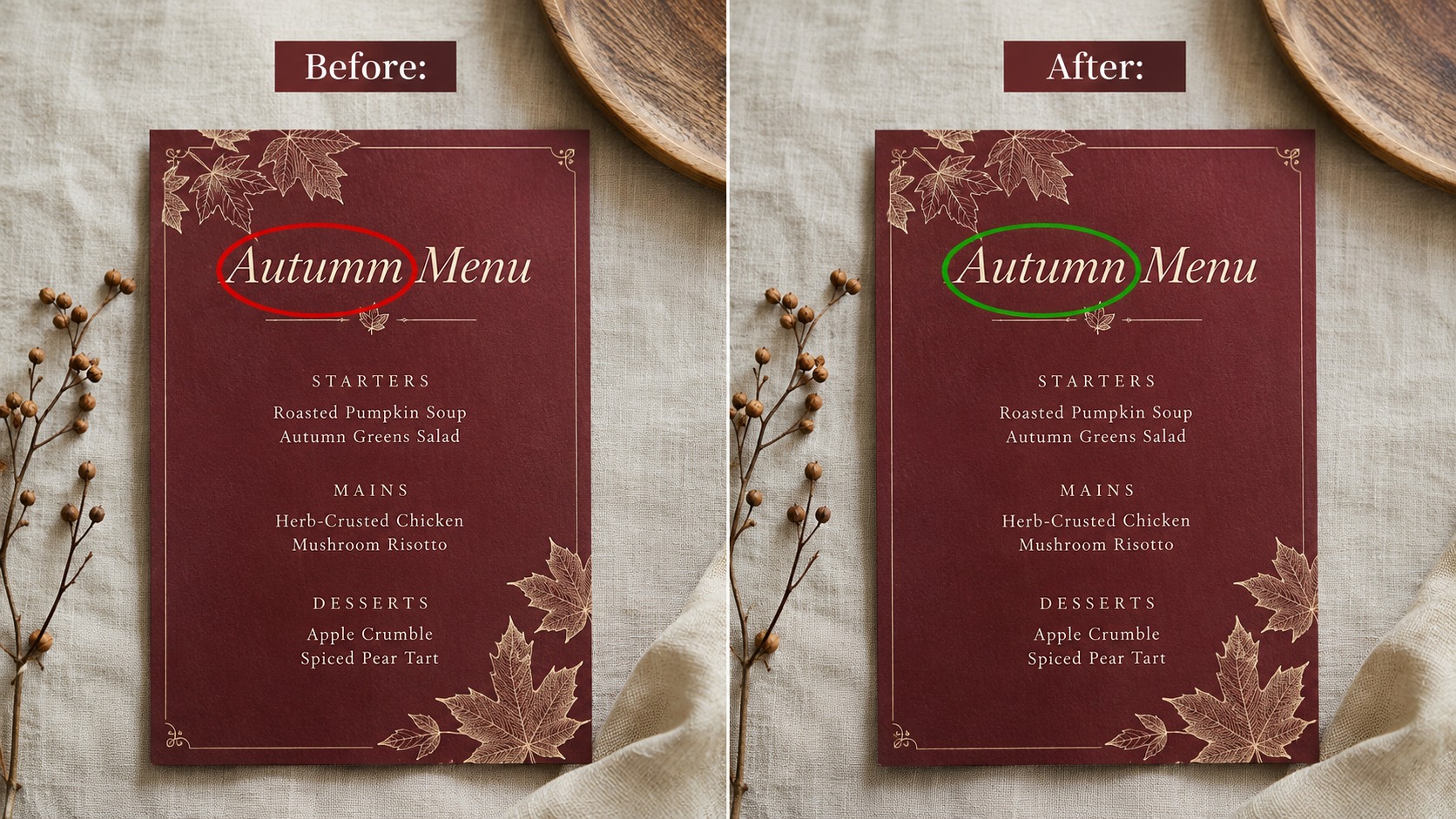
When one glyph is wrong and the layout is already good, regenerating the whole poster is the expensive mistake. Tell the editor what to keep and what to change—one change.
Copy block — one-change spell fix
Change only: the title string
to "Autumn Menu"
(exact spelling, capital A and M).
Keep exactly the same:
background color, motif, camera crop,
secondary line, footer, margins, lighting.
Do not redraw the layout.
Do not invent new words.
Rules that keep credits honest
- One wrong letter → one edit. Three wrong lines → three cheap edits, not one mega-rewrite.
- Always restate the correct quoted string in the edit. “Fix the typo” without the target string often re-melts.
- If micro-type still fails after a clean one-change pass and the layout is already right, re-run the same brief on a higher-fidelity model path only when the UI estimate makes sense—composition first, polish second. Plans and packs live under Related → pricing; this article stays on the typesetting loop.
Boundary (what this page is not)
- Not a Midjourney vs GPT Image dunk.
- Not a Vertex / Gemini “go try the API” CTA.
- Not the face-lock edit guide—that sister workflow is a different skeleton (identity lock → one-change → multi-ref). Stay here until your poster type is readable. Model overview and sister posts sit in Related.
Product CTA
Paste the quote-lock block, run the checklist, then one-change any melted letter—start the pass from Nano Banana text rendering in the generator.
FAQ
Why does small footer text melt first?
Dense small glyphs are the hardest case. Shorten the footer, bump contrast, or move the footer into a later layout layer outside the image.
Can I put a full paragraph on the poster?
For a first text-rendering pass, no. Title + sub + footer. Long body copy belongs in the design tool after you have a clean still.
Do I need a separate “free credits” page before I try?
No. Read the live estimate in the generator UI; plan details sit in Related → pricing—not in every paragraph here.